Eden Photographers Club Meeting - Tuesday, September 20th @ 7 pm EDT (Topic: Using negative space to your advantage)

Contributor: Jul!a Jul!a
Quote:
Originally posted by aliceinthehole
ooh, those are your feet? me likey. i bet with a little tweeking in photoshop you could amp up the contrast a bit and make this look even older. it's a pretty hot shot. i really like the angle and the old time feel juxtaposed with your modern tattoo.
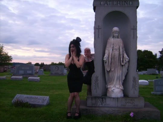
They are, although missing a few tattoos so a recreation now might be too distracting with all the ink there. Thanks
09/20/2011
Contributor: Starkiller87 Starkiller87
Quote:
Originally posted by aliceinthehole


hand on the wall. polaroid transfer. 2008.
The silhouette of this is quite lovely. The only thing I find distracting is the edge of the photo which has nothing to do with the actual photo itself. I think it would be cute in a scrap book but outside of one I find the outside to be harsh against the white eden background. ahaha so nothing really I can think of as a negative. I was stretching there.
09/20/2011
Contributor: sexyintexas sexyintexas
Quote:
Originally posted by aliceinthehole


hand on the wall. polaroid transfer. 2008.
Love the retro look with the different textures. The shadow from the head kind of throws me off a little but overall this picture kind of has me mesmerized.
09/20/2011
Contributor: sexyintexas sexyintexas
Quote:
Originally posted by seleena
ouch .. I got married in '76 .. teehee!
I got married in 85 so don't feel too bad
09/20/2011
Contributor: aliceinthehole aliceinthehole
Quote:
Originally posted by Jul!a
i think this would be even greater if the ratio was tweaked a little. a little less sidewalk (just smidge) and a little more space in front of the right foot would be just enough for me to make the ratio seem just right. it's a bit too square for my likings... i think it would be sexier in a more rectangular format. i'm not explaining myself very well but.. hopefully you get the jist.
09/20/2011
Contributor: Jul!a Jul!a
Quote:
Originally posted by aliceinthehole
i think this would be even greater if the ratio was tweaked a little. a little less sidewalk (just smidge) and a little more space in front of the right foot would be just enough for me to make the ratio seem just right. it's a bit too square for ... more
I get where you're going with that.
09/20/2011
Contributor: seleena seleena
cactus - I love the angle. Makes it look like "the might saguaro" but the back-tilt is very hard to avoid without some 'spensive gear. The tree is okay too but a little more out of focus would be nice.

guy on balcony - I find this one quite interesting and am fine with the very dark bottom third because there's still definition in his legs

heels - great use of sepia toning. I'd be tempted to remove a little foreground though.
09/20/2011
Contributor: Vaccinium Vaccinium
Quote:
Originally posted by aliceinthehole


hand on the wall. polaroid transfer. 2008.
I love the light and shadows of aliceinthehole's photo (and yet it's not too contrasty).

The vent at the top right is the sole distracting element, and even then, it's not that distracting.
09/20/2011
Contributor: sexyintexas sexyintexas
I have a picture that I love the idea I had when I took it and I want to do it again, but the reflection of the sunset in the mirror has me baffled at how to do it without taking away from the picture yet not keeping the glare. Care to offer suggestions?
09/20/2011
Contributor: seleena seleena
Quote:
Originally posted by seleena
cactus - I love the angle. Makes it look like "the might saguaro" but the back-tilt is very hard to avoid without some 'spensive gear. The tree is okay too but a little more out of focus would be nice.

guy on balcony - I find ... more
oops .. meant "The Mighty Saguaro"
09/20/2011
Contributor: Vaccinium Vaccinium
Quote:
Originally posted by aliceinthehole
this is puuuuurty. did you take it?
Yes, I did. Many years ago now.
09/20/2011
Contributor: Vaccinium Vaccinium
At this point, I thought I'd post the critiquing theme for the next month, but I'm going to shelve that idea for the time being. If enough people want me to start it anew in a few months, I'll reconsider it, but right now I just want everyone who wants to post photos for critiquing to do so, and I feel the themes are getting in the way of that.

That said, you can submit photos for critiquing above and beyond the one you can post during these meetings at our Eden Photographers tumblr site. Please feel free to visit the site if you want to critique more photos than the ones posted during these meetings as well.

Remember, any time you critique a photo, either formally or informally, it can help you as a photographer. Get into the habit of looking at photos and see what you can take away from each of them. It will make you a better photographer.

Should you require further direction on how to submit the photos and critique photos, check out the critiquing article on the Eden Clubs and Events blog.
09/20/2011
Contributor: aliceinthehole aliceinthehole
starkilla... it's a polaroid transfer, so the emulsion was lifted up as one entity, then placed back on watercolor. that made the edges all funky. it was a bit of an experiment i suppose!

sexy n texy, i agree, the head is a bit oddly shaped!


the photo was taken after one night, i got stoned to ease menstrual cramps and took a candle lit bath. upon stepping out of the bath i noticed my lace curtain making a pattern on the wall, due to the street lamp outside shining through. i rushed to set up my tripod and took my first self portraits.

i submitted this for my first color film photo class in college, and sold it the same year in a group show.
09/20/2011
Contributor: Starkiller87 Starkiller87
Quote:
Originally posted by aliceinthehole
starkilla... it's a polaroid transfer, so the emulsion was lifted up as one entity, then placed back on watercolor. that made the edges all funky. it was a bit of an experiment i suppose!

sexy n texy, i agree, the head is a bit oddly ... more
Ive done Polaroid transfers so I know. But the eden white makes it seem funky. HAHAH. Im not used to seeing them on white I guess, usually I see them on black flat backgrounds. Like I said I was stretching to say something "negative" on it. It is a great photo.
09/20/2011
Contributor: aliceinthehole aliceinthehole
Quote:
Originally posted by Vaccinium
Yes, I did. Many years ago now.
i really love that man. it's incredible. you could win a ton of photo contests with that one. you should frame and sell it at some gallery or cafe in your town! if you havent already.
09/20/2011
Contributor: seleena seleena
Quote:
Originally posted by aliceinthehole


hand on the wall. polaroid transfer. 2008.
Can't think of any ways to improve this one. The dark square in the top left is distracting yet is does give some balance .. so I dunno.
09/20/2011
Contributor: aliceinthehole aliceinthehole
Quote:
Originally posted by Starkiller87
Ive done Polaroid transfers so I know. But the eden white makes it seem funky. HAHAH. Im not used to seeing them on white I guess, usually I see them on black flat backgrounds. Like I said I was stretching to say something "negative" on it. ... more
tank youuuuus.
09/20/2011
Contributor: Starkiller87 Starkiller87
I want to post the two photos I originally picked out to share. But Ill wait till the meeting is officially over so I dont get in the way of business.
09/20/2011
Contributor: Vaccinium Vaccinium
And that's it. Thanks to all of you who attended the meeting tonight. That went a bit quicker than I had anticipated, but I wasn't sure how much time to allocate to critiquing. I think next time we can have each of you post two photos for critiquing if you like AND I can beef up the tutorial. There seems to be plenty of time for that.

Don't forget the submit your photos to me for the calendar we are putting together. There are just 10 more days to submit photos, and we need lots more to make this work. PLEASE send in your photos! A complete list of the monthly photo themes can be found here.

Feel free to continue chatting here if you so desire. Otherwise, good night, everyone!
09/20/2011
Contributor: aliceinthehole aliceinthehole
Quote:
Originally posted by Vaccinium
At this point, I thought I'd post the critiquing theme for the next month, but I'm going to shelve that idea for the time being. If enough people want me to start it anew in a few months, I'll reconsider it, but right now I just want ... more
did you end up with enough photos for the calendar, btw? whats the status on that?
09/20/2011
Contributor: Starkiller87 Starkiller87
And I want to see the other ones everyone else said they picked out multiples for today.
09/20/2011
Contributor: Vaccinium Vaccinium
Quote:
Originally posted by Starkiller87
I want to post the two photos I originally picked out to share. But Ill wait till the meeting is officially over so I dont get in the way of business.
Go right ahead. We finished much earlier than I had anticipated.
09/20/2011
Contributor: aliceinthehole aliceinthehole
Quote:
Originally posted by aliceinthehole
did you end up with enough photos for the calendar, btw? whats the status on that?
goodnight all!
09/20/2011
Contributor: Jul!a Jul!a
Quote:
Originally posted by Vaccinium
And that's it. Thanks to all of you who attended the meeting tonight. That went a bit quicker than I had anticipated, but I wasn't sure how much time to allocate to critiquing. I think next time we can have each of you post two photos for ... more
Thank you so much for hosting, you really do a wonderful job
09/20/2011
Contributor: Starkiller87 Starkiller87


These are the two I originally thought of sharing. Like my usual mo they are on the darker side.
09/20/2011
Contributor: sexyintexas sexyintexas
Quote:
Originally posted by Starkiller87
I want to post the two photos I originally picked out to share. But Ill wait till the meeting is officially over so I dont get in the way of business.
I want to post that one but I will wait til we are done and check for ideas on how to do it better next time. It was the sunsetting in the reirview mirror of the 18 wheeler in the desert. It looked great in real life but ehh in pictures, couldn't get rid of the glare.
09/20/2011
Contributor: Vaccinium Vaccinium
Quote:
Originally posted by aliceinthehole
i really love that man. it's incredible. you could win a ton of photo contests with that one. you should frame and sell it at some gallery or cafe in your town! if you havent already.
Thank you.

I've never been that interested in selling my work, as I've been working towards including it all in books. Perhaps I'll move in that direction once the books get published (whenever that might be).
09/20/2011
Contributor: Vaccinium Vaccinium
Quote:
Originally posted by Starkiller87
And I want to see the other ones everyone else said they picked out multiples for today.
I'll tell ya what. I'll post one of mine.
09/20/2011
Contributor: seleena seleena
Quote:
Originally posted by Vaccinium
And that's it. Thanks to all of you who attended the meeting tonight. That went a bit quicker than I had anticipated, but I wasn't sure how much time to allocate to critiquing. I think next time we can have each of you post two photos for ... more
it was fun! thank you Vaccinium and thanks to everyone
09/20/2011
Contributor: sexyintexas sexyintexas
09/20/2011